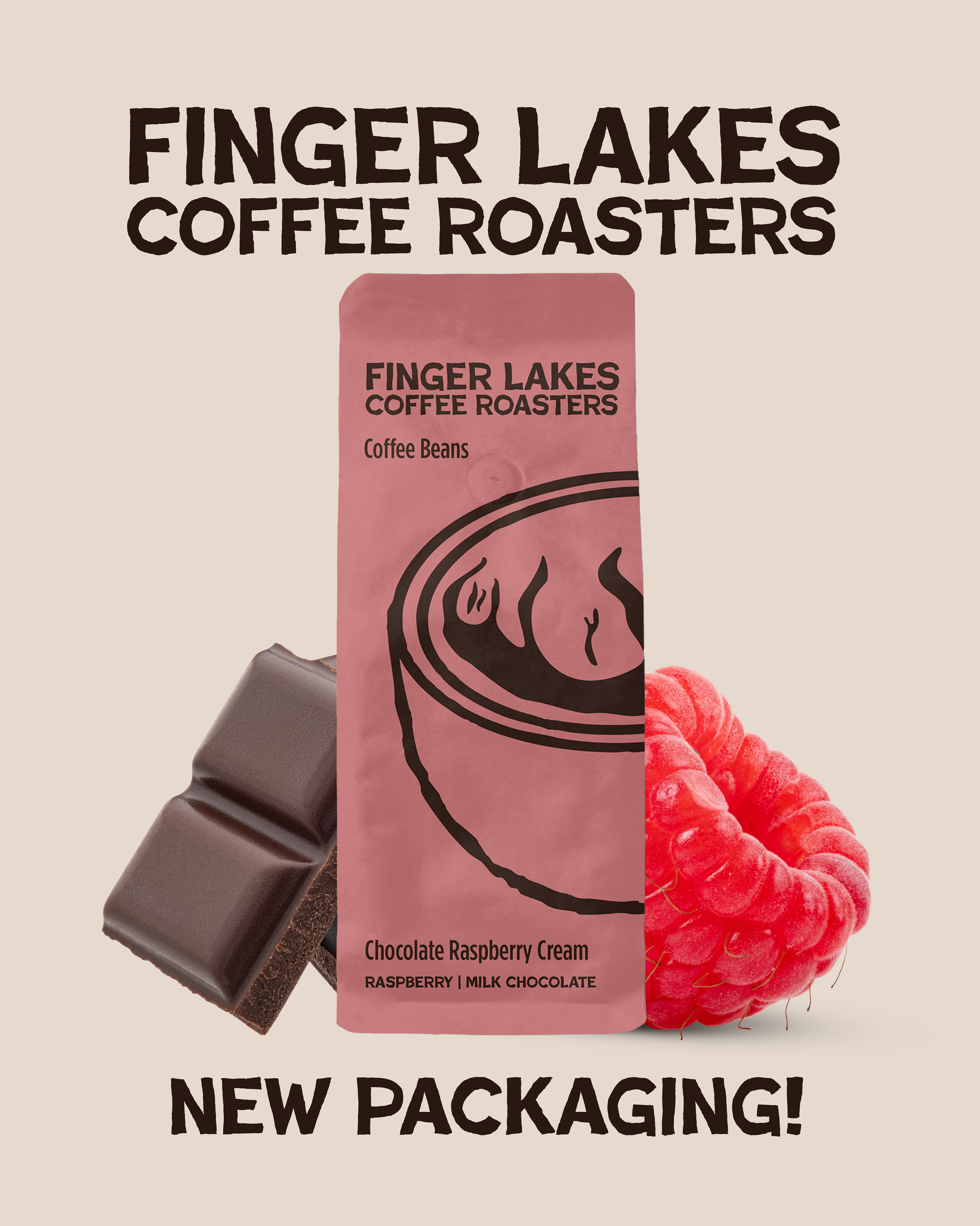
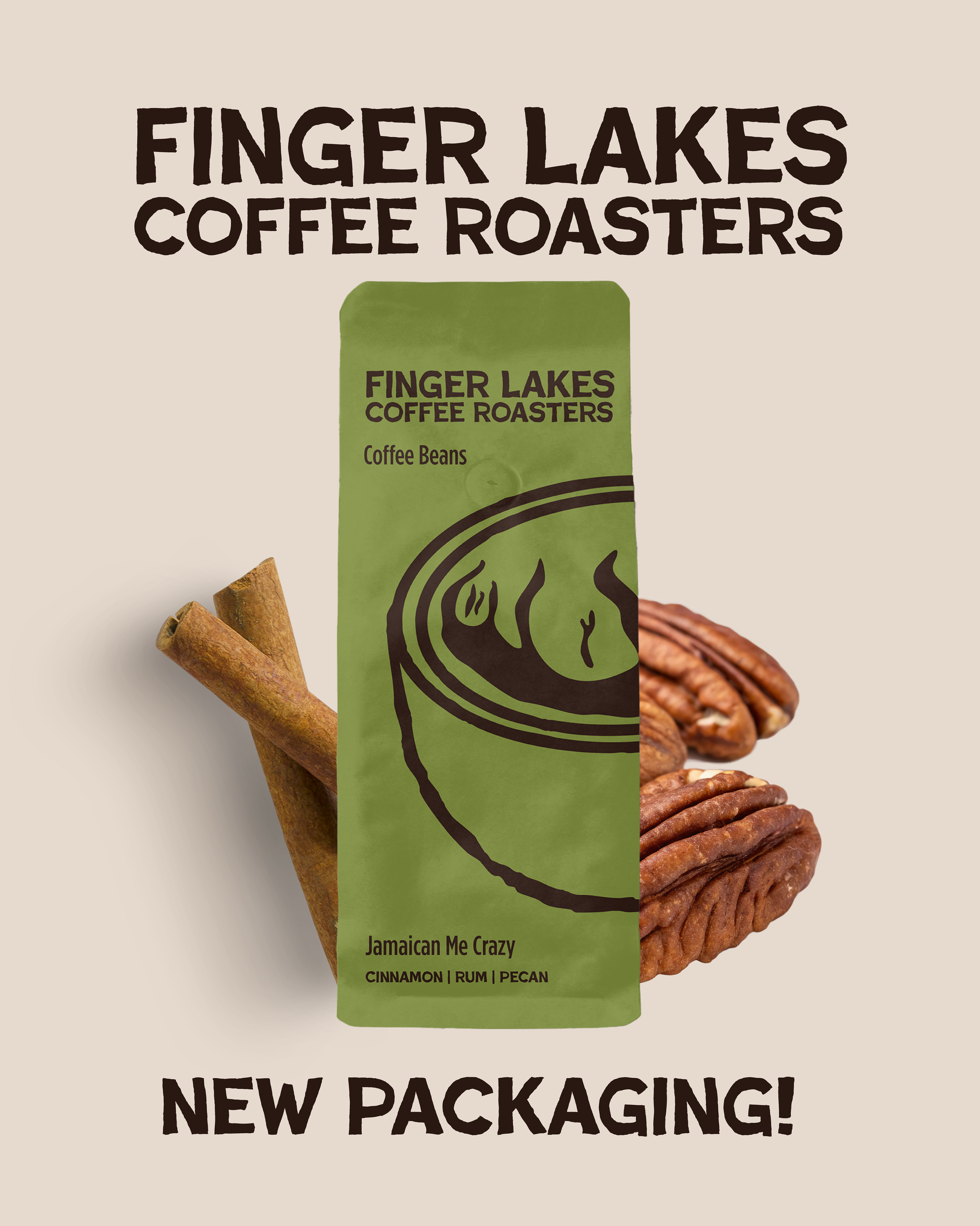
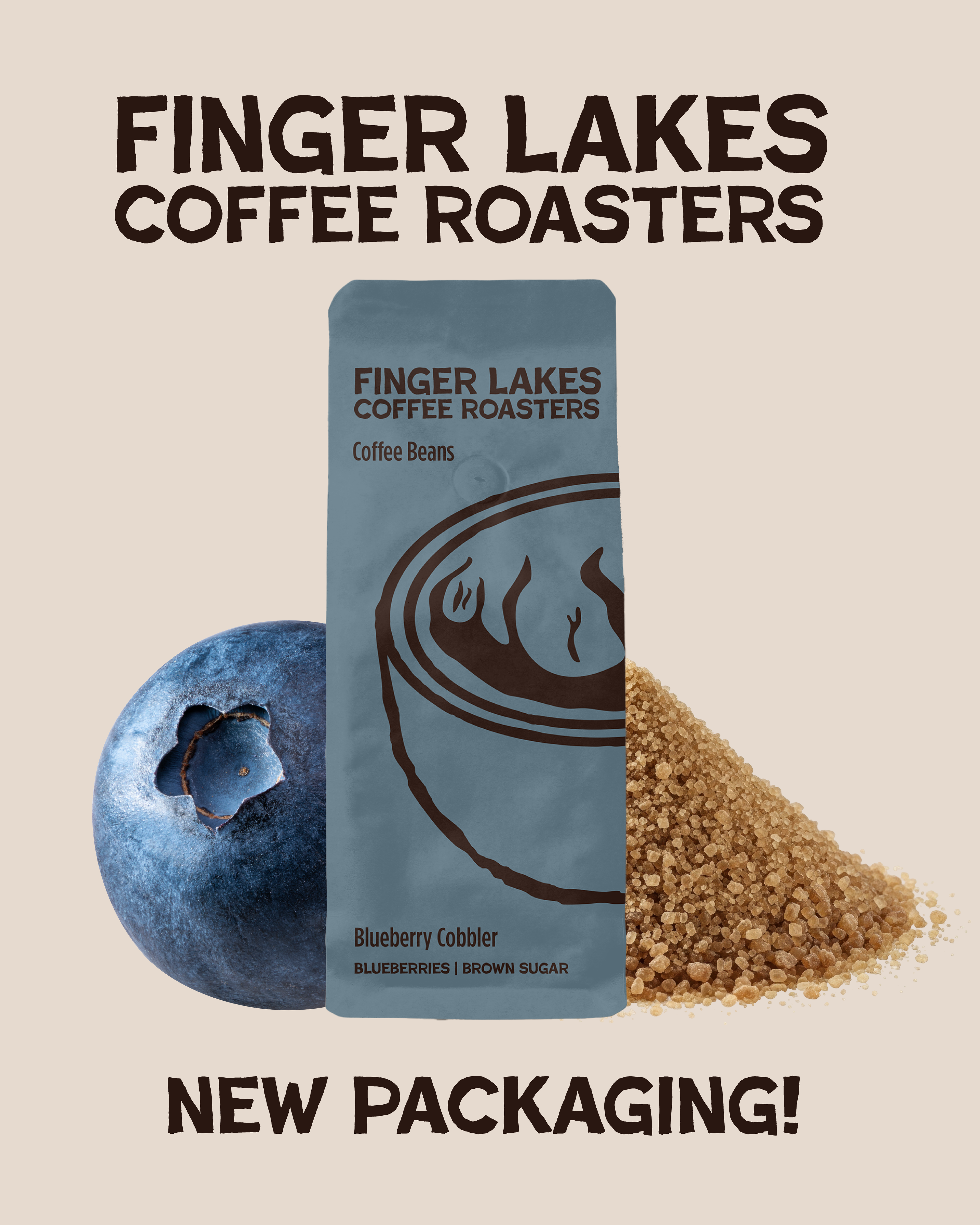
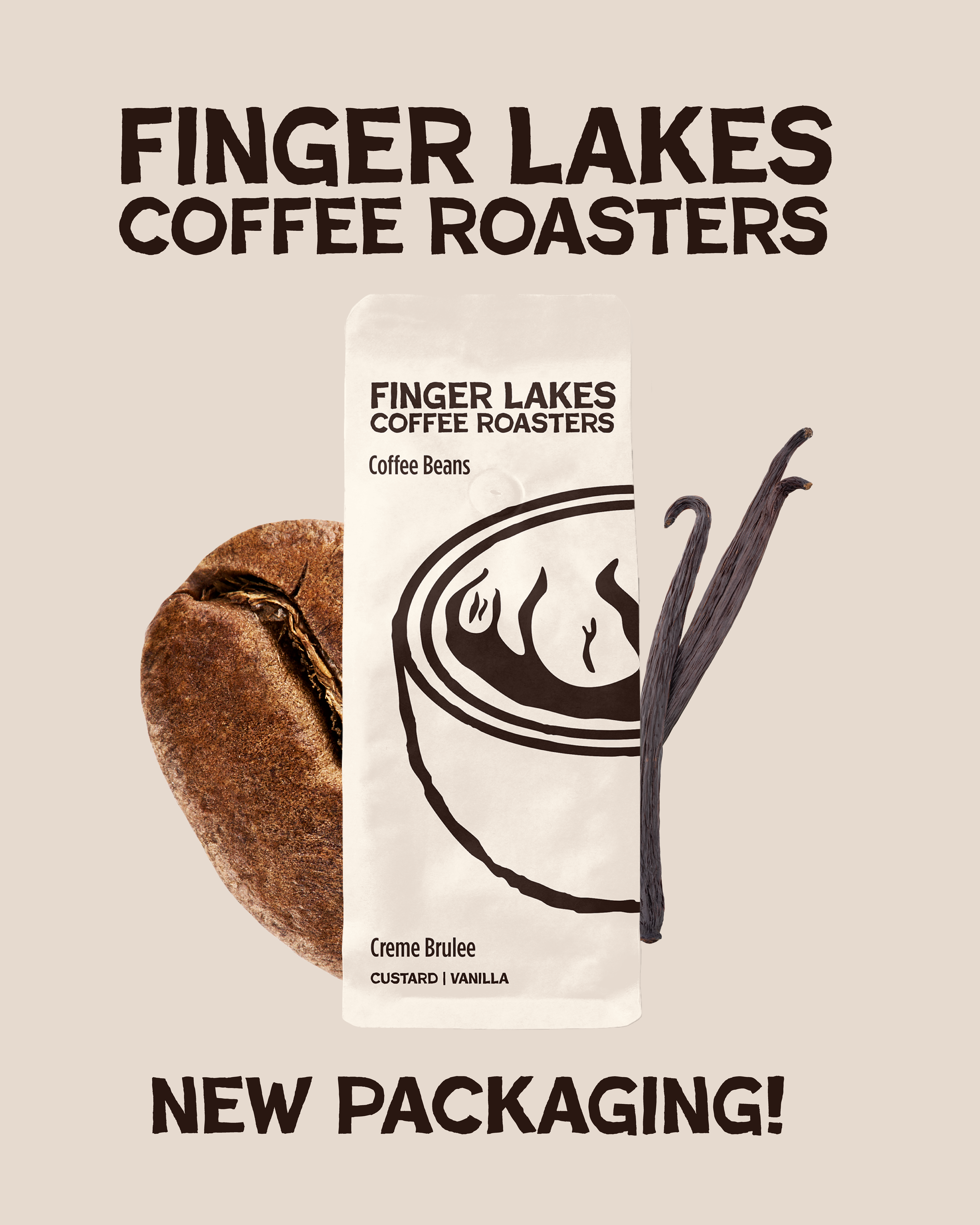
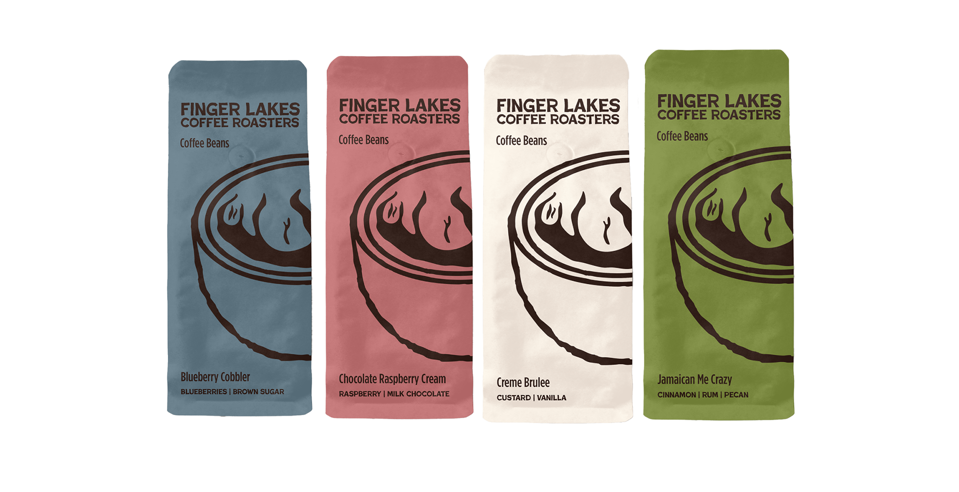
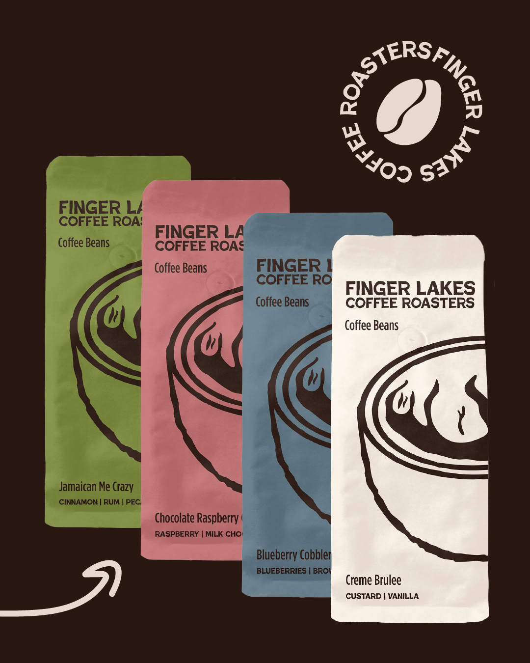
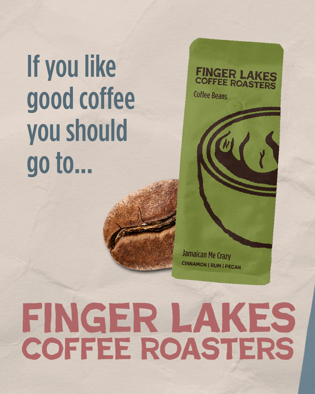
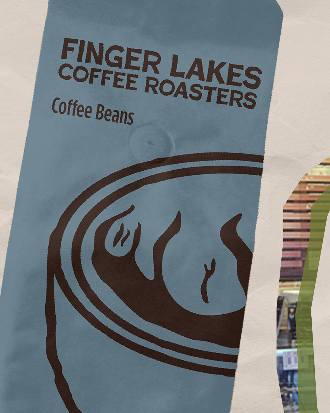
Rebranded coffee bag packaging.
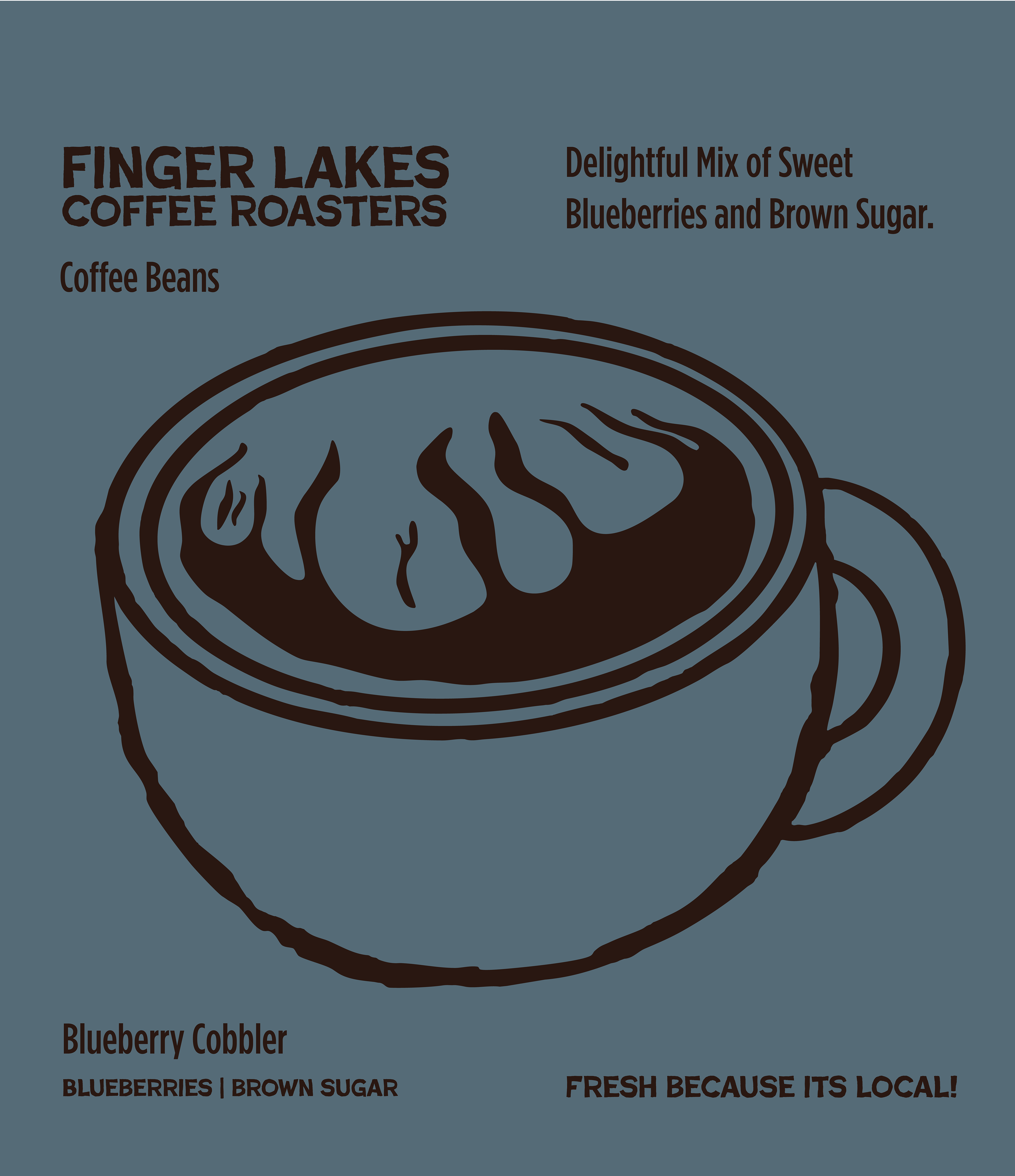
This project was called the "before and after" project. I chose the brand Finger Lakes Coffee Roasters, since they are a local brand that I enjoy that could benefit from a rebrand. I focused on branding, packaging, and social media assets.
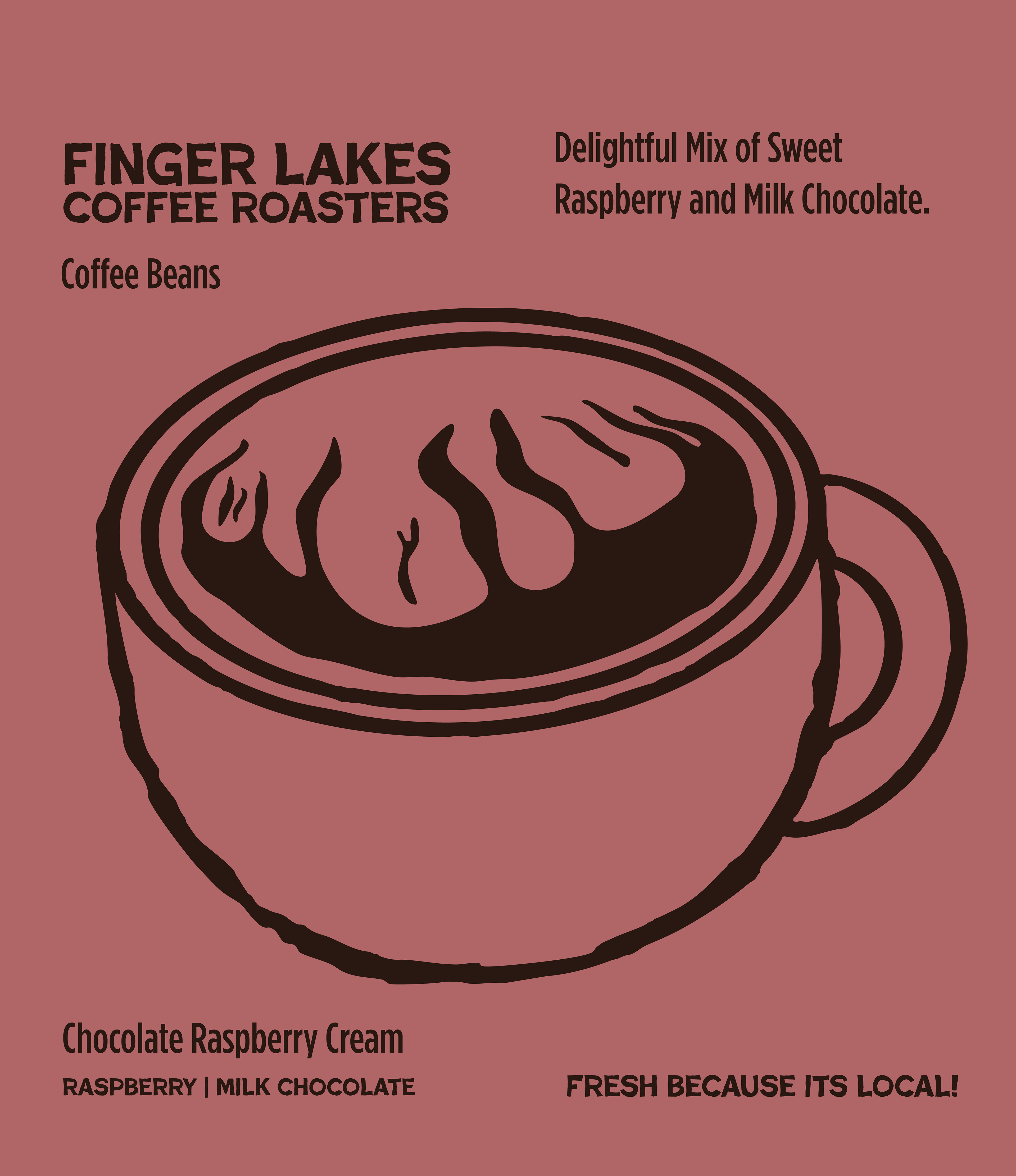
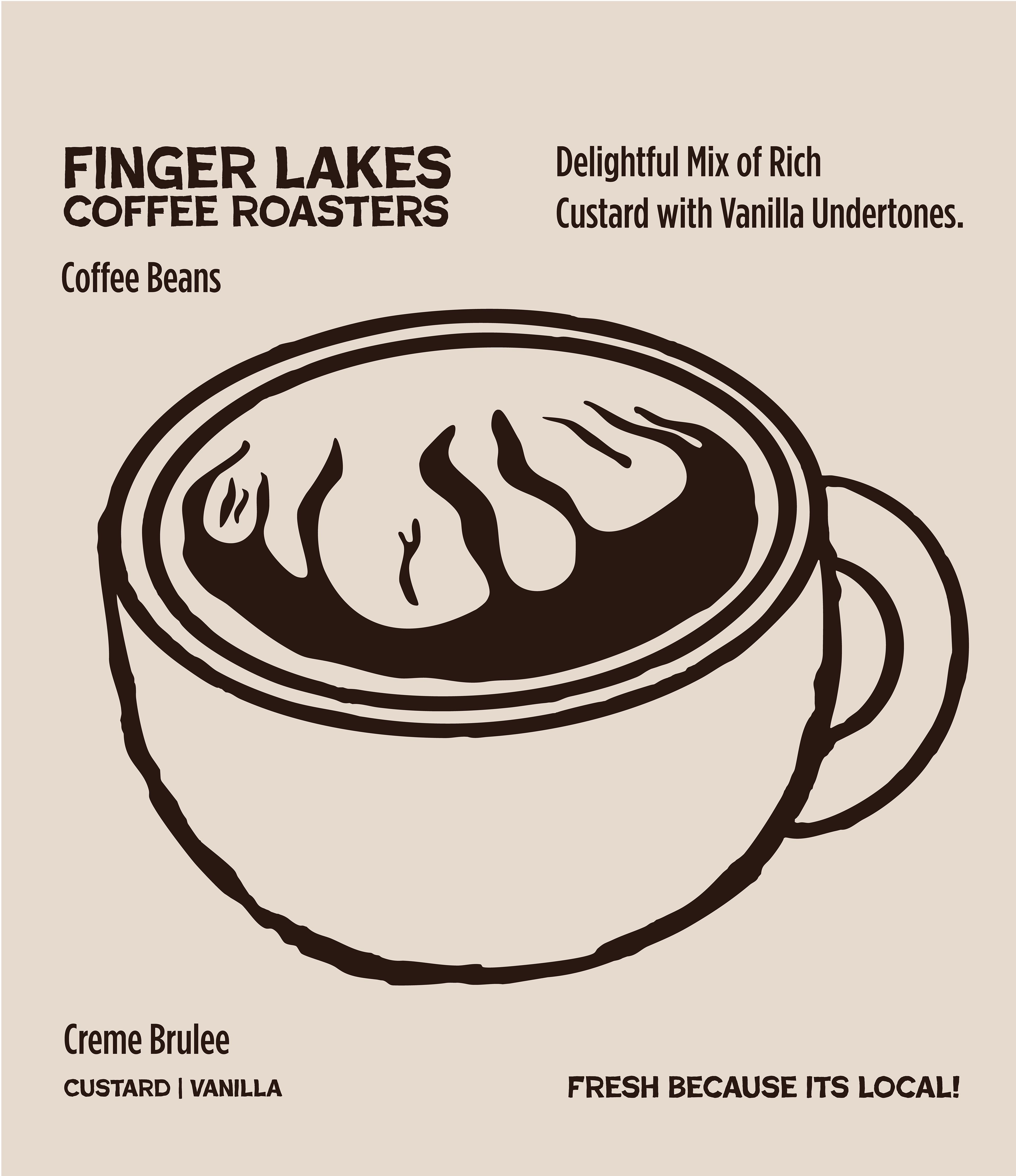
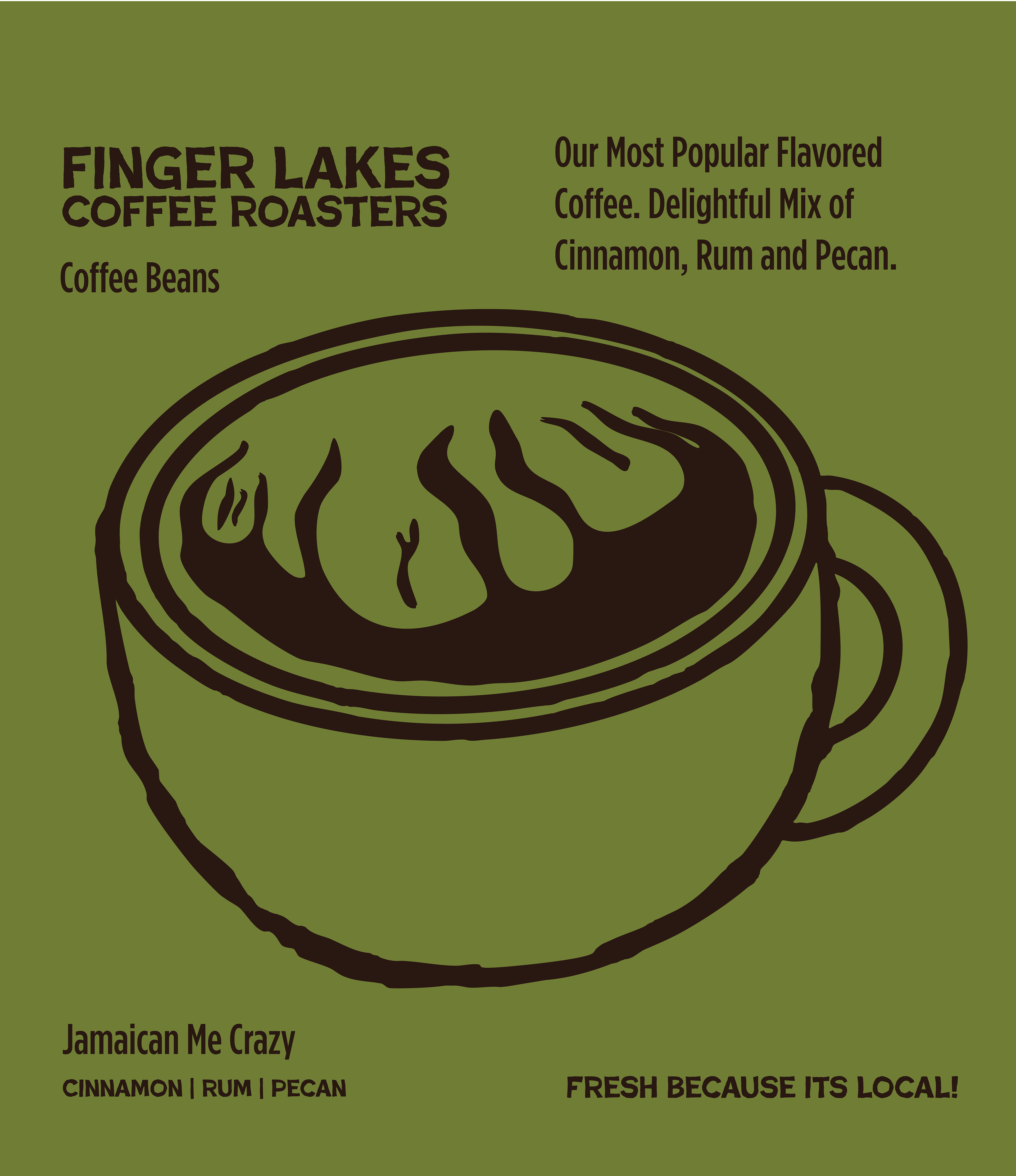
I began with physical sketches, then transitioned to digital sketches, visualizing what I wanted to achieve for a new logo, taking inspiration from their old logo and integrating parts of it into the new logo. I decided to keep the coffee mug imagery while incorporating the shape of the finger lakes.
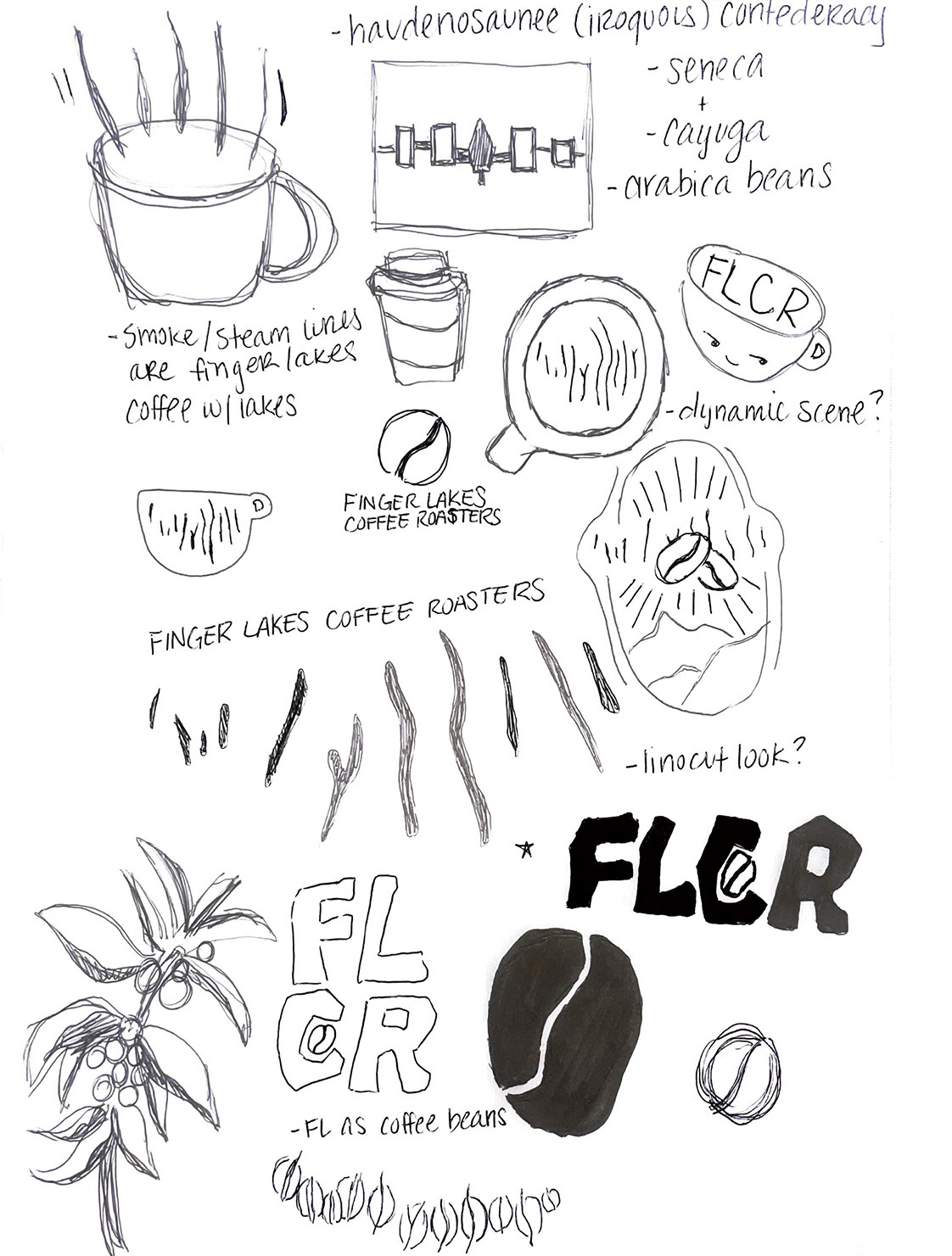
physical sketches
digital sketches
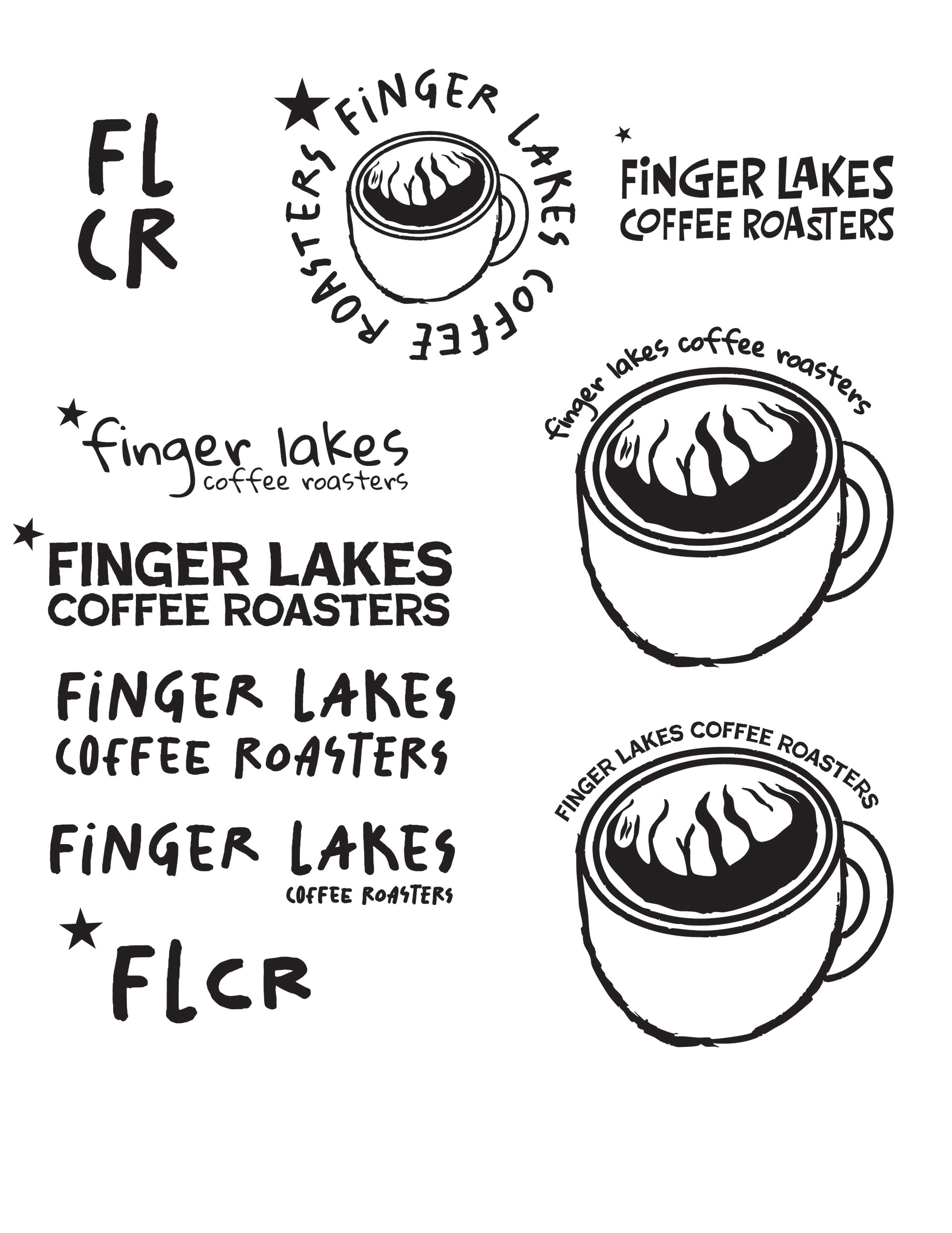
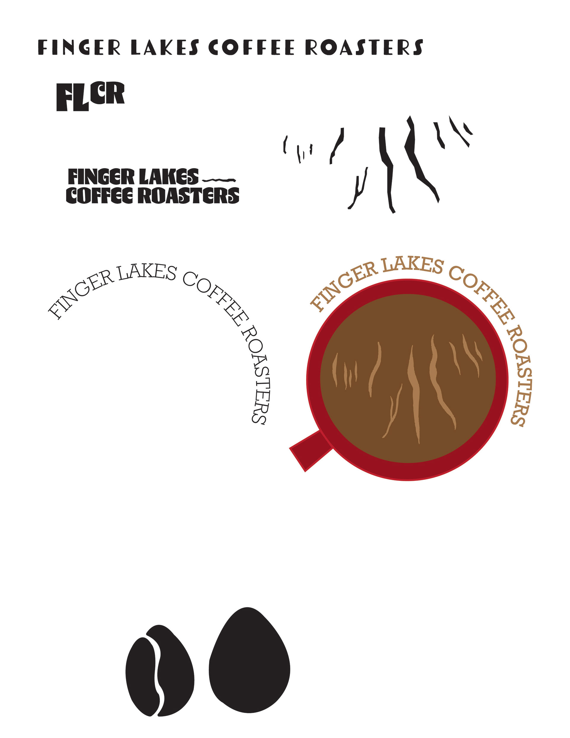
digital sketches and iterations
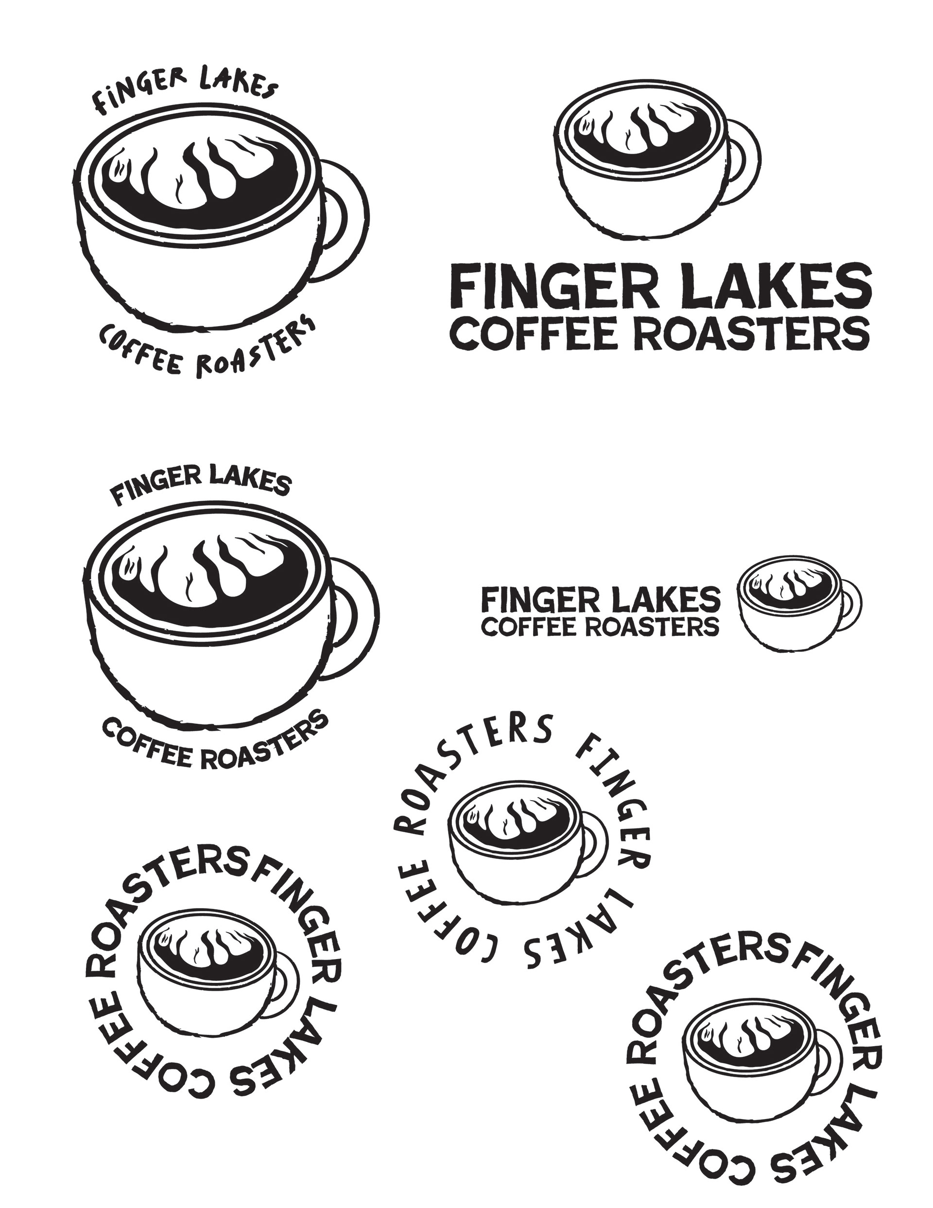
iterations
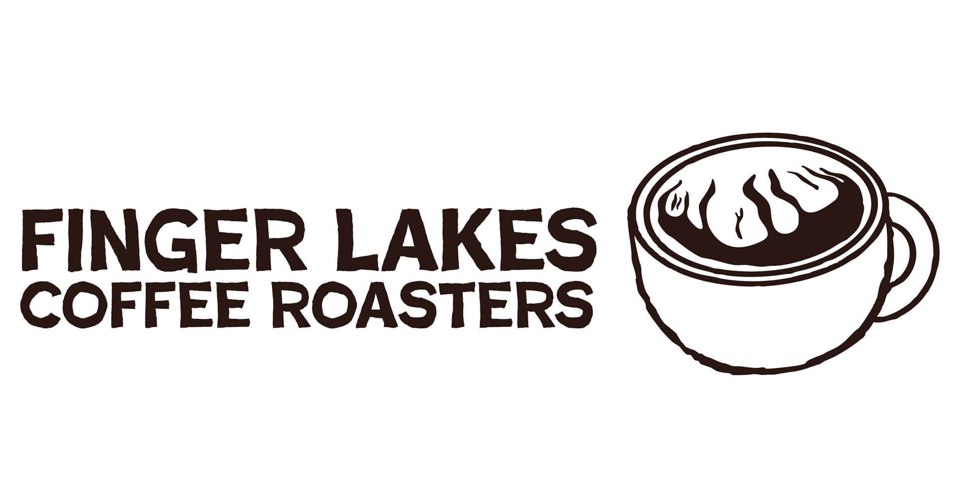
primary logo
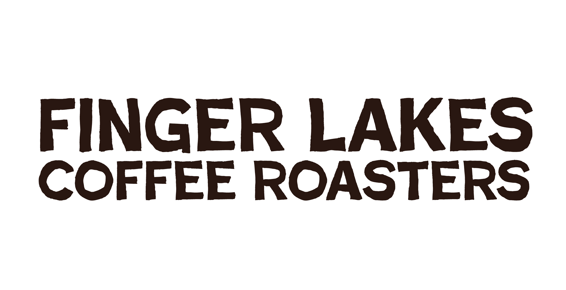
logotype
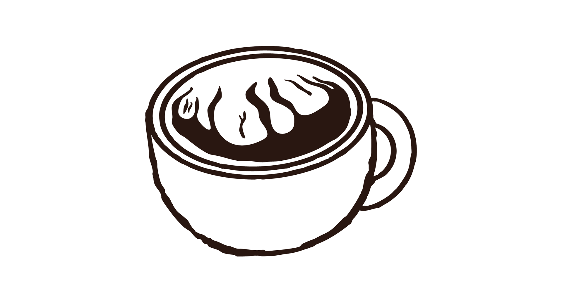
logo icon
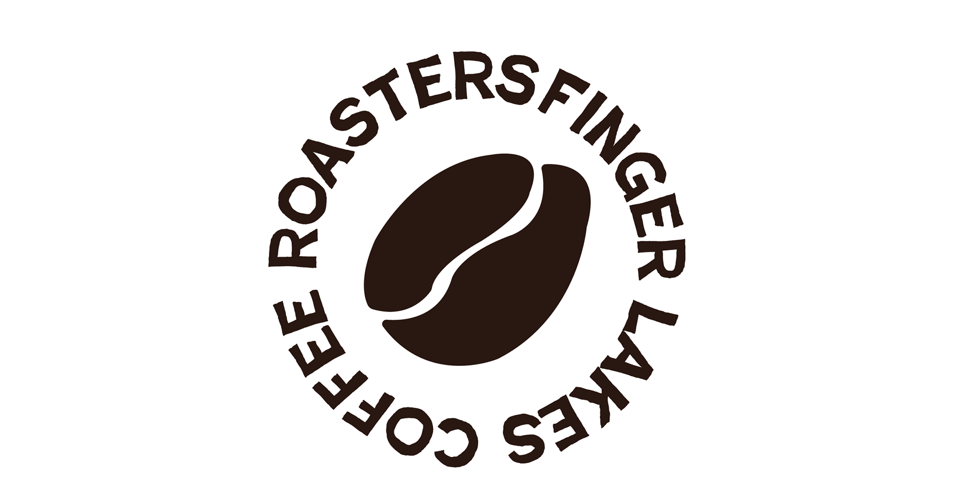
secondary logo
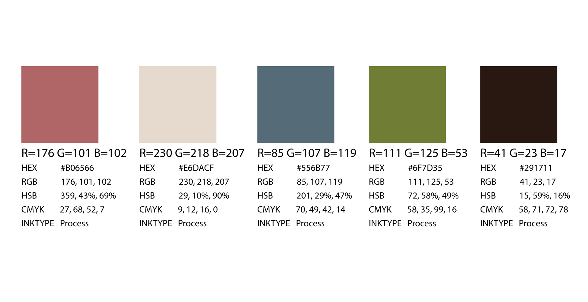
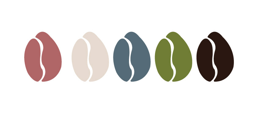
colors

typography
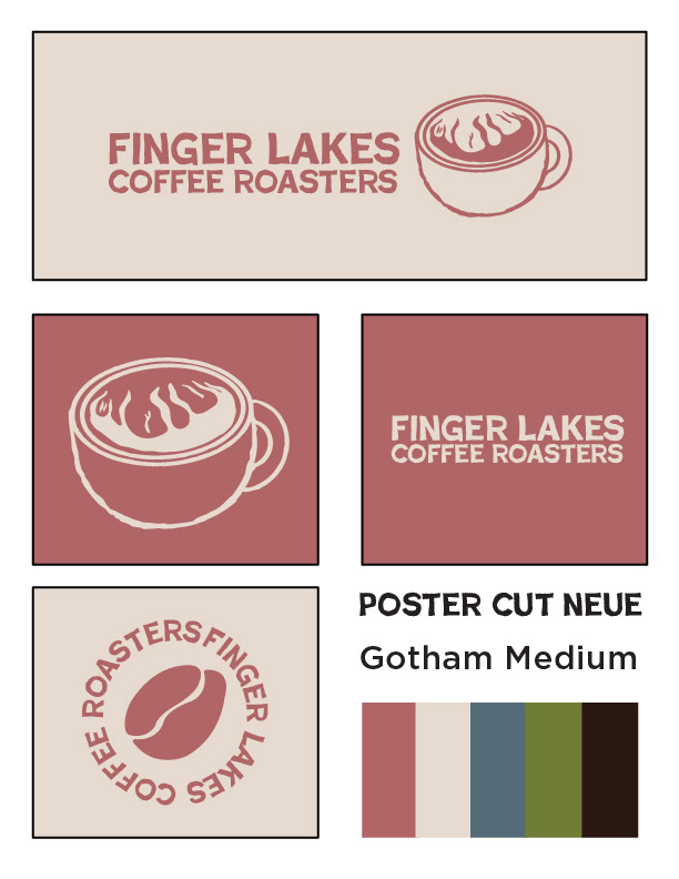
new branding color way
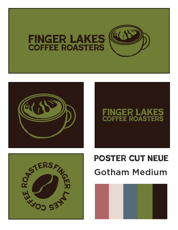
new branding colorway
additional assets
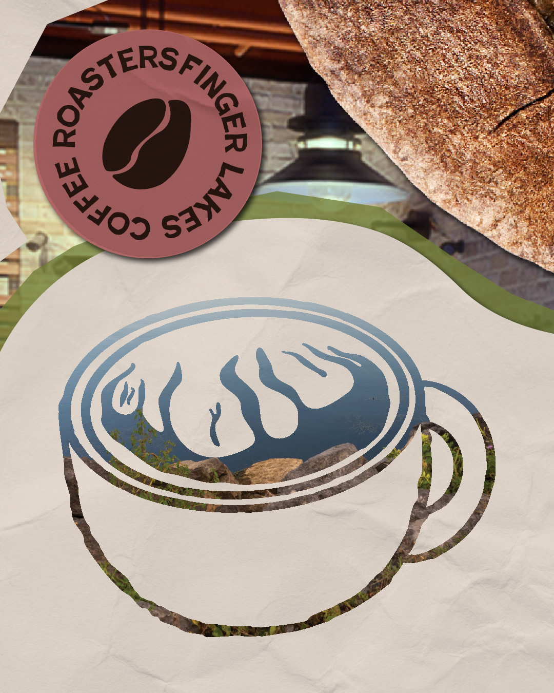
New brand system for Finger Lakes Coffee Roasters.
After creating new branding, I did research and looked at what was missing from FLCR's brand. A more consistent social media presence and new packaging for their product were things I thought could elevate the brand's identity.
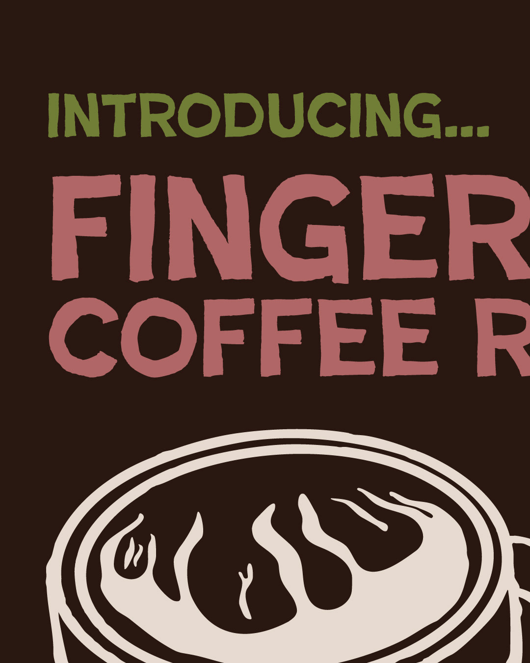
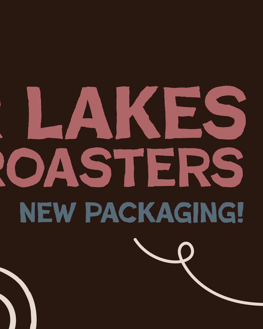
New packaging social media promotion carousel.
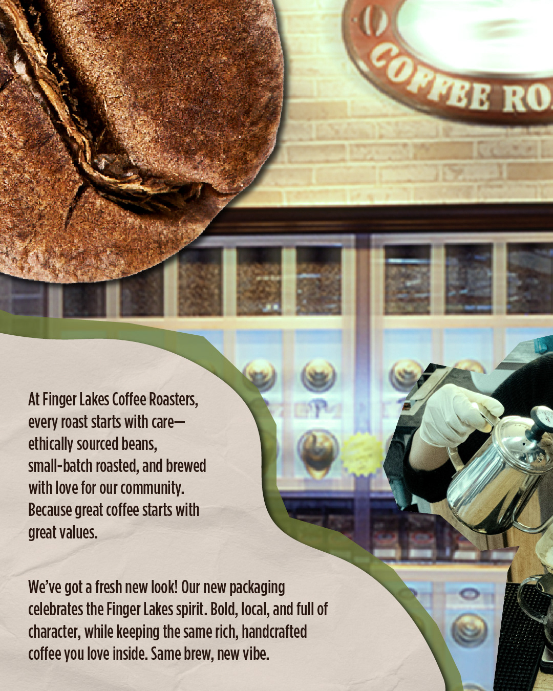
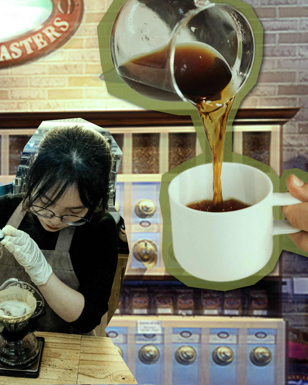
General store social media promotion carousel.
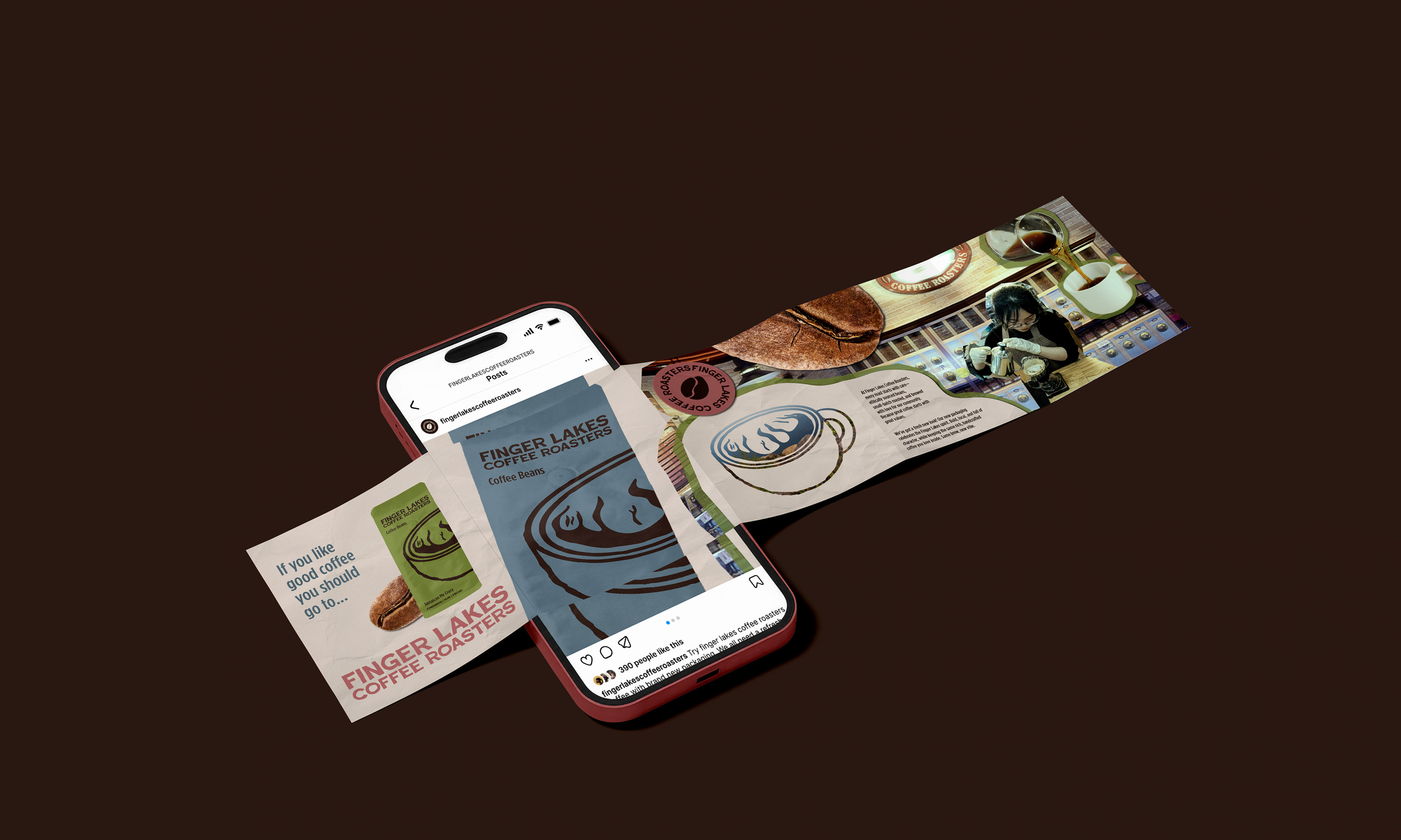
Social media carousel mockup.
Takeaways
A good product can be elevated to be a great product just by paying attention to the culture around the brand. By observing the clientele of FLCR and the overall vibe of the company, I was able to create a brand that resonates more with their current market and reflects what current customers already appreciate from the brand, while creating an opportunity for reaching a new market with a modern and fresh rebrand.